In the realm of painting, the choices of color extend far beyond aesthetics. Southeast Painters understand the profound impact that color can have on the human psyche, influencing emotions, mood, and even productivity. In this exploration of the psychology of color, we delve into how Southeast Painters harness the power of hues to create spaces that not only look visually appealing but also contribute to a positive and productive atmosphere.
The Impact of Color on Emotions:
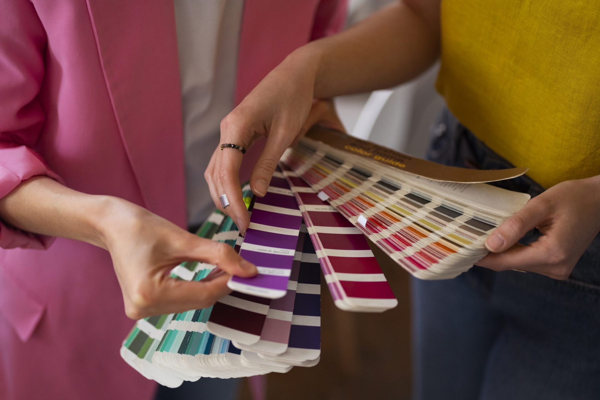
Colors possess the remarkable ability to evoke specific emotions and moods. Southeast Painters recognize this and leverage their expertise to select the right colors for different spaces. For instance:
Calming Blues and Greens:
Southeast Painters often opt for tranquil blues and greens in spaces intended for relaxation or concentration. These colors are known to reduce stress, promote a sense of calm, and improve focus, making them ideal for bedrooms, offices, and study areas.
Energizing Reds and Yellows:
In spaces where energy and vibrancy are desired, such as gyms or communal areas, We may use energetic reds and yellows. These warm hues are associated with increased energy levels and can stimulate conversation and activity.
Neutral Tones for Versatility:
Southeast Painters understand the importance of neutral tones like whites, grays, and beiges. These colors provide a versatile backdrop, allowing other elements in the space to stand out while creating a clean and timeless aesthetic.
The Role of Natural Light:
Southeast Painters also consider the impact of natural light on color perception. Rooms with ample sunlight allow for a broader spectrum of colors, enhancing the vibrancy of chosen hues. Conversely, spaces with limited natural light may benefit from lighter colors to create a brighter and more open feel.
Productivity Boost through Strategic Color Selection:
In the workplace, the choice of paint colors by Southeast Painters goes beyond mere aesthetics—it becomes a strategic tool to enhance productivity. Consider these applications:
Cool Blues and Greens in Offices:
Offices often feature calming blues and greens to foster a serene environment conducive to concentration and productivity. These colors can help reduce stress and create a harmonious workspace.
Ergonomic Designs in Industrial Spaces:
Southeast Painters working in industrial settings understand the importance of color-coded systems. Different colors may be used to delineate safety zones, mark equipment, or highlight specific areas, contributing to a more organized and efficient work environment.
Creative Hues in Artistic Studios:
Studios and creative spaces benefit from the use of stimulating colors like purples and oranges. These hues can ignite creativity and inspire innovative thinking among artists and creators.
Case Study:
Southeast Painters Crafting a Productive Office Space:
Let’s take a closer look at a Southeast Painters project involving the transformation of a conventional office space. Recognizing the need for improved productivity and employee well-being, the painters selected a palette of soft blues and greens for the walls.
The reception area featured calming blue tones, creating a welcoming and stress-free atmosphere for both clients and employees. In individual offices, greens were used to evoke a sense of balance and focus. Common areas were adorned with neutral tones to provide a versatile and timeless backdrop for collaborative activities.
The result? An office space that not only looked professional but also contributed to enhanced mood and productivity among employees.
Blue:
Blue is often associated with tranquility, trust, and dependability. Southeast Painters strategically use varying shades of blue to create a sense of calm and reliability in spaces where focus and concentration are crucial.
Green:
Green is linked to nature, growth, and balance. By incorporating green hues, Southeast Painters bring a touch of the outdoors indoors, fostering a harmonious atmosphere that promotes well-being and productivity.
Red:
Red is a color of passion, energy, and urgency. While too much red can be overwhelming, Southeast Painters use it strategically in spaces where increased energy and attention are desired, such as in gym areas or spaces meant for quick decision-making.
Yellow:
Yellow is associated with positivity, energy, and warmth. Southeast Painters may incorporate shades of yellow in spaces where a sunny and uplifting atmosphere is needed, promoting a sense of happiness and enthusiasm.
Strategic Color Placement:
Beyond the choice of color, Southeast Painters are mindful of where and how they apply these hues to optimize their impact:
Accent Walls:
Creating an accent wall in a bold color can draw attention and create a focal point in a room. Southeast Painters may strategically place these walls to enhance specific features or to break up the monotony of a larger spaces.
Color Gradients:
Southeast Painters may use color gradients to create a sense of movement and flow within a space. This technique can be particularly effective in open-concept areas where a seamless transition between different functions is desired.
Contrast and Balance:
The interplay of light and dark colors, warm and cool tones, creates a sense of balance. Southeast Painters carefully consider these contrasts to ensure that the overall effect is visually appealing and contributes to a harmonious environment.
Conclusion:
We are not merely artisans wielding brushes and rollers; they are skilled psychologists who understand the profound impact of color on the human experience. By strategically selecting and applying colors based on their psychological effects, we contribute to the creation of spaces that not only look visually appealing but also enhance mood and productivity. Whether it’s a residential haven, a bustling commercial space, or an industrial setting, Southeast Painters bring an understanding of the psychology of color to every stroke, creating environments that leave a lasting positive impression on those who inhabit them.
